Responsive Web Design
What is Responsive Web Design?
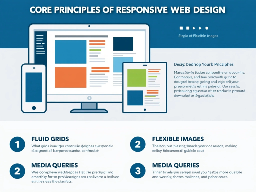
Responsive web design (RWD) is a design approach that makes web pages render well on a variety of devices and screen sizes. RWD uses fluid grids, flexible images, and CSS media queries to ensure a consistent look and feel across devices.
Why Responsive Design Matters
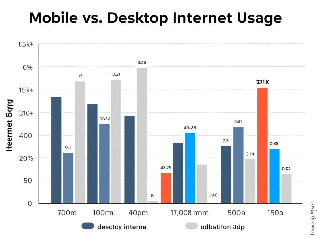
In a world where mobile internet usage has surpassed desktop, responsive design isn’t optional—it’s a necessity. Responsive websites not only enhance user experience but also improve SEO rankings, reduce bounce rates, and increase conversion rates.

Key Principles of Responsive Design
Fluid Grids :
Fluid grids allow your layout to adapt based on the user’s screen size, using relative units like percentages instead of fixed pixels.
Flexible Images :
Flexible images resize within their containing elements, ensuring images fit appropriately on various screens.
Media Queries :
Media queries apply different CSS rules depending on the screen size or device type, allowing you to customize the layout as needed.

Common Responsive Design Pitfalls and How to Avoid Them
Responsive design can be tricky to master. Here are common mistakes and how to avoid them:
- Neglecting Mobile Optimization - Always test on mobile devices first.
- Ignoring Load Times - Large images can slow down mobile performance; use optimized images.
- Overusing Media Queries - Keep it simple and only add media queries when necessary.
Conclusion
Responsive web design is a fundamental skill for any web developer or designer. By following these principles and best practices, you’ll ensure your websites provide a great user experience on any device. Start small with a mobile-first approach, use flexible grids and images, and remember to test thoroughly across devices.